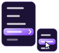
Menu contextuel ouvert au niveau du pointeur (clic droit), par appui long sur écran tactile ou au clavier (Maj+F10 / touche Menu) ; réutilise le moteur et les styles de Menu, y compris l’animation data-motion="glide".
Agent IA avec le serveur MCP de Marvelous UI : install_components({ slugs: ["context-menu"], target_dir: "<absolute path>/src/marvelous", framework: "react" }).
Same option as mv-menu: the panel blooms from the click point, the highlight glides between items, submenus slide in.
Properties
Name
Type
Description
isOpen
boolean
Read-only.
menu
MenuPanel
Instance of the engine shared with mv-menu.
strings
Partial<Record<string, string>>
Overrides for the default text (en-US): menu (menu name when the target has no aria-label). App-wide translations: setStrings() from core/i18n.js, under the key "context-menu". Can be set before the element is defined.
Methods
Name
Description
openAt(x, y, { focus })
Opens at viewport coordinates; focus = "first" | "panel".
hide({ focus })
Closes; focus=true returns focus to the element that was active before opening (or to the area).
Target area; made focusable (tabindex=0) if it isn’t. Its aria-label names the menu.
[data-content]
Panel: same markup as mv-menu (menuitem, checkbox, radio, [data-submenu], <hr>, .mv-menu-label, .mv-menu-shortcut).
CSS classes
Name
Description
mv-context-menu-area
Ready-made dashed area (visual feedback during long-press).
CSS variables
Name
Description
--mv-menu-*
All Menu variables apply (width, highlight, background, radius).
Accessibility
role=menu panel (APG “Menu” pattern) with full navigation: ↑↓ Home/End, typeahead, → / ← for submenus, Escape and Tab close. Keyboard opening via Shift+F10 or the Menu key from the focusable area (focus on the first item); focus then returns to the original element.