Icon <mv-icon>
선택한 세트로 그려지는 하나의 의미 기반 아이콘 어휘(close, search, chevron-down…)입니다. 기본은 Lucide이고, Iconoir가 내장되어 있으며, registerIcons()로 원하는 세트나 스프라이트를 연결할 수도 있고, 크기와 선 굵기는 토큰 두 개로 공유됩니다.
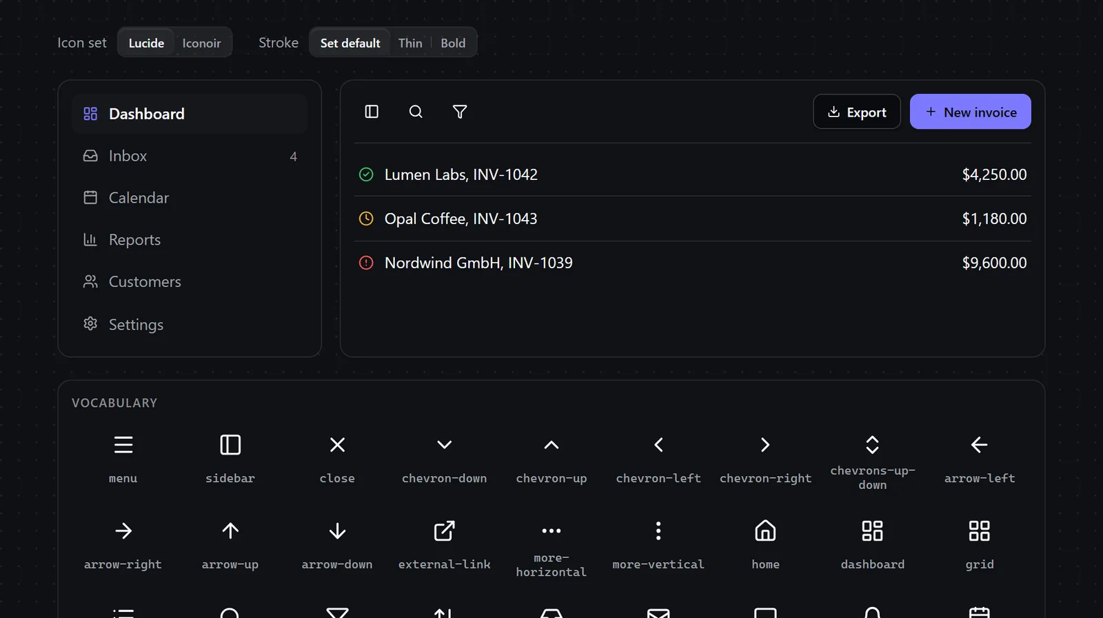
| 카테고리 | 기본 요소 |
|---|---|
| 유형 | Web Component (<mv-icon>) |
| 상태 | 안정 |
| Keywords | icon, icons, svg, lucide, iconoir, icon-set, sprite, provider, vocabulary, currentcolor |
When to use
- An app shell, sidebar or toolbar needs consistent icons in buttons, menu items and navigation links
- A product must switch its whole icon style, Lucide or Iconoir, without touching the markup
- A team already owns an icon set or SVG sprite and wants every component to draw with it
- A status needs an icon that screen readers announce, like a paid or overdue invoice marker
Avoid when
- The icon should morph between two states, hamburger to close or play to pause → use Icon Morph instead
- The graphic is an illustration, a logo or a multicolor brand mark rather than a line icon
- A one-off drawing appears once on a page: an inline
<svg>needs no vocabulary
설치
node scripts/add.mjs icon --out ./src/marvelousMarvelous UI MCP 서버를 사용하는 AI 에이전트: install_components({ slugs: ["icon"], target_dir: "<absolute path>/src/marvelous", framework: "react" }).
복사되는 파일(의존성 포함): tokens/tokens.css, core/base.css, core/element.js, components/icon/icon.js, components/icon/icon-lucide.js, components/icon/icon-iconoir.js, components/icon/icon.css, components/icon/LICENSES.txt.
사용법
기본 마크업입니다. 여기서 시작해 속성, data-*, CSS 변수로 커스터마이즈하세요:
<div id="icon-demo" data-mv-icons="lucide">
  <style>
    #icon-demo { display: grid; gap: 1.25rem; width: 100%; max-width: 56rem; margin-inline: auto; }
    #icon-demo .icd-controls { display: flex; flex-wrap: wrap; gap: .75rem 1.5rem; align-items: center; }
    #icon-demo .icd-control { display: flex; align-items: center; gap: .6rem; font-size: .8125rem; color: var(--mv-fg-muted); }
    #icon-demo .icd-row { display: grid; grid-template-columns: minmax(0, 15rem) minmax(0, 1fr); gap: 1rem; }
    @media (width < 40rem) { #icon-demo .icd-row { grid-template-columns: minmax(0, 1fr); } }
    #icon-demo .icd-panel { border: 1px solid var(--mv-border); border-radius: var(--mv-radius-lg); background: var(--mv-surface); padding: .75rem; min-width: 0; }
    #icon-demo .icd-nav { list-style: none; margin: 0; padding: 0; display: grid; gap: .125rem; }
    #icon-demo .icd-nav a { display: flex; align-items: center; gap: .625rem; padding: .45rem .6rem; border-radius: var(--mv-radius-md); color: var(--mv-fg-muted); font-size: .875rem; text-decoration: none; }
    #icon-demo .icd-nav a:hover { background: var(--mv-bg-muted); color: var(--mv-fg); }
    #icon-demo .icd-nav a[aria-current="page"] { background: var(--mv-bg-muted); color: var(--mv-fg); font-weight: 500; }
    #icon-demo .icd-nav a[aria-current="page"] mv-icon { color: var(--mv-accent); }
    #icon-demo .icd-nav .icd-count { margin-inline-start: auto; font-size: .75rem; color: var(--mv-fg-subtle); }
    #icon-demo .icd-toolbar { display: flex; flex-wrap: wrap; align-items: center; gap: .5rem; padding-bottom: .75rem; border-bottom: 1px solid var(--mv-border); }
    #icon-demo .icd-toolbar .icd-push { margin-inline-start: auto; display: flex; gap: .5rem; }
    #icon-demo .icd-invoices { list-style: none; margin: .5rem 0 0; padding: 0; display: grid; }
    #icon-demo .icd-invoices li { display: flex; align-items: center; gap: .6rem; padding: .55rem .25rem; font-size: .875rem; border-bottom: 1px solid var(--mv-border); }
    #icon-demo .icd-invoices li:last-child { border-bottom: 0; }
    #icon-demo .icd-invoices .icd-amount { margin-inline-start: auto; font-variant-numeric: tabular-nums; }
    #icon-demo .icd-ok { color: var(--mv-success); }
    #icon-demo .icd-late { color: var(--mv-danger); }
    #icon-demo .icd-wait { color: var(--mv-warning); }
    #icon-demo .icd-head { margin: 0 0 .5rem; font: 600 .7rem var(--mv-font-sans); letter-spacing: .06em; text-transform: uppercase; color: var(--mv-fg-subtle); }
    #icon-demo .icd-grid { display: grid; grid-template-columns: repeat(auto-fill, minmax(5.5rem, 1fr)); gap: .25rem; margin: 0; padding: 0; list-style: none; }
    #icon-demo .icd-grid li { display: grid; justify-items: center; gap: .4rem; padding: .7rem .25rem .55rem; border-radius: var(--mv-radius-md); color: var(--mv-fg); --mv-icon-size: 1.375rem; }
    #icon-demo .icd-grid li:hover { background: var(--mv-bg-muted); }
    #icon-demo .icd-grid code { font: .6875rem/1.2 var(--mv-font-mono); color: var(--mv-fg-muted); text-align: center; overflow-wrap: anywhere; }
  </style>

  <div class="icd-controls">
    <div class="icd-control"><span id="icon-demo-set-label">Icon set</span>
      <mv-segmented id="icon-demo-set" aria-labelledby="icon-demo-set-label" value="lucide" data-size="sm">
        <button value="lucide">Lucide</button>
        <button value="iconoir">Iconoir</button>
      </mv-segmented>
    </div>
    <div class="icd-control"><span id="icon-demo-weight-label">Stroke</span>
      <mv-segmented id="icon-demo-weight" aria-labelledby="icon-demo-weight-label" value="default" data-size="sm">
        <button value="default">Set default</button>
        <button value="1.25">Thin</button>
        <button value="2.5">Bold</button>
      </mv-segmented>
    </div>
  </div>

  <div class="icd-row">
    <nav class="icd-panel" aria-label="Demo navigation">
      <ul class="icd-nav">
        <li><a href="#icon-demo" aria-current="page"><mv-icon name="dashboard"></mv-icon>Dashboard</a></li>
        <li><a href="#icon-demo"><mv-icon name="inbox"></mv-icon>Inbox<span class="icd-count">4</span></a></li>
        <li><a href="#icon-demo"><mv-icon name="calendar"></mv-icon>Calendar</a></li>
        <li><a href="#icon-demo"><mv-icon name="chart"></mv-icon>Reports</a></li>
        <li><a href="#icon-demo"><mv-icon name="users"></mv-icon>Customers</a></li>
        <li><a href="#icon-demo"><mv-icon name="settings"></mv-icon>Settings</a></li>
      </ul>
    </nav>

    <section class="icd-panel" aria-label="Invoices">
      <div class="icd-toolbar">
        <button class="mv-button" data-variant="ghost" data-size="icon-sm" type="button" aria-label="Toggle sidebar"><mv-icon name="sidebar"></mv-icon></button>
        <button class="mv-button" data-variant="ghost" data-size="icon-sm" type="button" aria-label="Search invoices"><mv-icon name="search"></mv-icon></button>
        <button class="mv-button" data-variant="ghost" data-size="icon-sm" type="button" aria-label="Filter"><mv-icon name="filter"></mv-icon></button>
        <span class="icd-push">
          <button class="mv-button" data-variant="outline" data-size="sm" type="button"><mv-icon name="download"></mv-icon>Export</button>
          <button class="mv-button" data-size="sm" type="button"><mv-icon name="plus"></mv-icon>New invoice</button>
        </span>
      </div>
      <ul class="icd-invoices">
        <li><mv-icon class="icd-ok" name="success" label="Paid"></mv-icon>Lumen Labs, INV-1042<span class="icd-amount">$4,250.00</span></li>
        <li><mv-icon class="icd-wait" name="clock" label="Pending"></mv-icon>Opal Coffee, INV-1043<span class="icd-amount">$1,180.00</span></li>
        <li><mv-icon class="icd-late" name="error" label="Overdue"></mv-icon>Nordwind GmbH, INV-1039<span class="icd-amount">$9,600.00</span></li>
      </ul>
    </section>
  </div>

  <section class="icd-panel" aria-labelledby="icon-demo-all">
    <h3 class="icd-head" id="icon-demo-all">Vocabulary</h3>
    <ul class="icd-grid" id="icon-demo-grid"></ul>
  </section>

  <script type="module">
    const root = document.getElementById("icon-demo");
    const grid = document.getElementById("icon-demo-grid");
    customElements.whenDefined("mv-icon").then(() => {
      const names = customElements.get("mv-icon").names("lucide");
      grid.replaceChildren(...names.map((name) => {
        const li = document.createElement("li");
        const icon = document.createElement("mv-icon");
        icon.setAttribute("name", name);
        const code = document.createElement("code");
        code.textContent = name;
        li.append(icon, code);
        return li;
      }));
    });
    document.getElementById("icon-demo-set").addEventListener("mv-change", (e) => {
      root.setAttribute("data-mv-icons", e.detail.value);
    });
    document.getElementById("icon-demo-weight").addEventListener("mv-change", (e) => {
      if (e.detail.value !== "default") root.style.setProperty("--mv-icon-stroke", e.detail.value);
      else root.style.removeProperty("--mv-icon-stroke");
    });
  </script>
</div>
API
Attributes
| Name | 유형 | Description |
|---|---|---|
name | string | Marvelous UI icon name: close, search, chevron-down… (names() lists them). An unknown name logs one console warning and draws a neutral dashed square, never an error. |
set | lucide | iconoir | Set for this icon only, or the name of a set you registered. Otherwise data-mv-icons on the closest ancestor, then the page default (setIconSet / registerIcons), then Lucide. |
label | string | Accessible name. With it the icon is announced (role="img"); without it the icon is decorative (aria-hidden). |
data-mv-icons | string | On <html> or any container (not only on mv-icon): the set used by every icon inside. Changing it redraws them. |
Properties
| Name | 유형 | Description |
|---|---|---|
name / set / label | string | Mirror the attributes. |
Methods
| Name | Description |
|---|---|
registerIcons(resolver, options?) | Module export (also MvIcon.registerIcons). Plugs in any set: resolver(name, semanticName) returns an SVG string (whole <svg> or inner markup), an Element, or null. Options: name ("custom"), map ({ close: "x-mark" }: our names to yours), fallback (a set used when the resolver returns null, e.g. "lucide"), stroke, viewBox, use (true: becomes the page default). |
registerIconSet({ name, icons, stroke?, attrs?, viewBox?, fallback? }) | Module export (also MvIcon.registerIconSet). Adds a set, or adds icons to one: registerIconSet({ name: "lucide", icons: { rocket: '<path d="…"/>' } }). An icon is its inner SVG markup or a list of [tag, attributes]. |
setIconSet(name) / getIconSet() | Module exports (also static). Page default set. |
iconNames(set?) | Module export (MvIcon.names): the names a set draws. |
createIcon(name, { set, label, context }?) | Module export (also static). A standalone <svg> for code that cannot render <mv-icon>; it does not follow later set changes. |
refresh() | Redraws if the set, the name or the registered icons changed (automatic in every documented case). |
Content structure
| Name | Description |
|---|---|
(default) | An <svg> written inside the element wins over name: a per-instance override that still gets the size, stroke and accessibility handling. |
CSS variables
| Name | Default | Description |
|---|---|---|
--mv-icon-size | 1em | Width and height of the icon box (set on the icon or any ancestor). The box exists before the element upgrades, so nothing shifts. |
--mv-icon-stroke | the set's own (Lucide 2, Iconoir 1.5) | Stroke width in viewBox units for every stroked set, so switching sets keeps one weight. Fill-based icons are left alone. |
Accessibility
Decorative by default: the element gets aria-hidden="true" and its <svg> aria-hidden and focusable="false", so an icon next to visible text is not read twice. With label (or an author aria-label / aria-labelledby) it becomes role="img" with that name. An icon-only button keeps its name on the button (aria-label), not on the icon. Icons draw with currentColor, so they follow text color, hover states and forced-colors mode. Limits: the icon is never focusable or interactive by itself; a custom resolver's SVG strings are trusted page code (scripts, foreignObject and on* handlers are stripped, nothing else).